- Published on
Discover the secrets of captivating web design. Unleash your creativity and create stunning websites that leave a lasting impression.
or I'll work for FREE until we reach this target.
After more than +20 years of UX/UI experience and +5 years of CRO experience running A/B tests for 7-8 figure brands, I know what works.
Want guaranteed results?
Book a callOnly 2 spots left
FREE Quick WinOnly 2 spots left

20 years of conversion design experience will get you at least 20% more revenue, but the numbers don't stop there.
While Conversion Rate is the common metric everyone looks at, I look at revenue increases as that includes LTV, AOV as well as CR. There's missed potential looking only at CR.
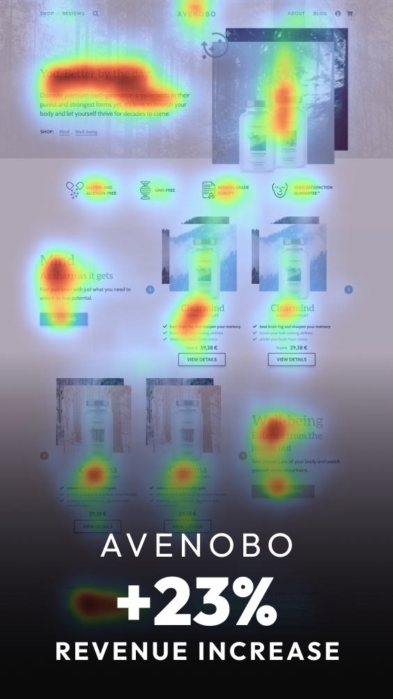
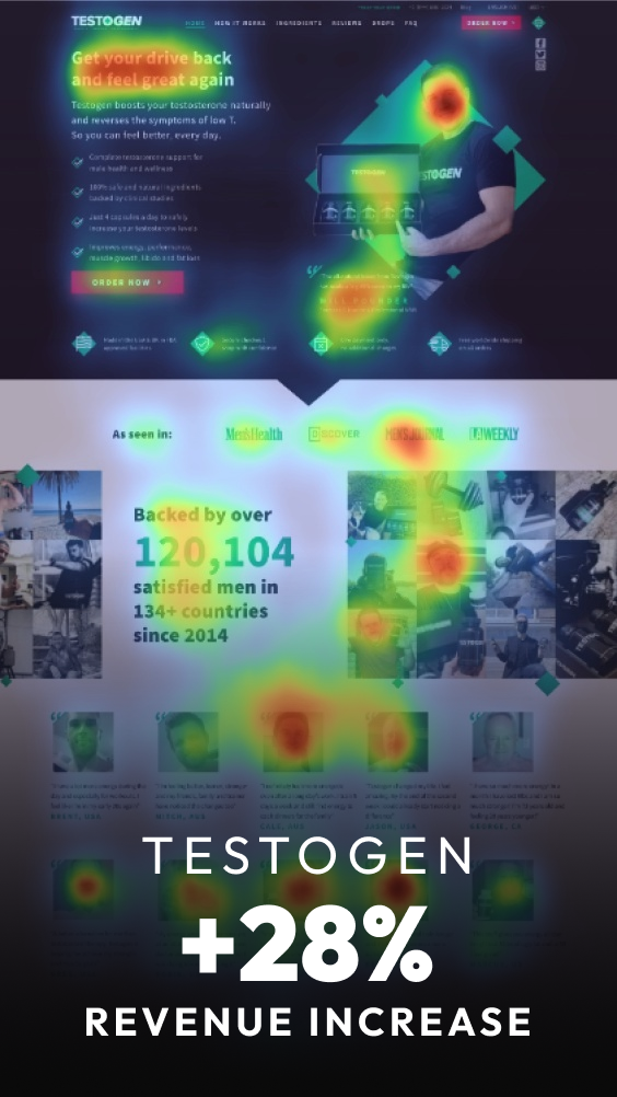
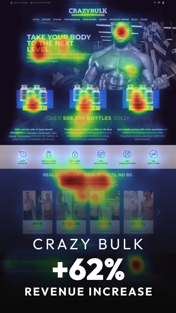
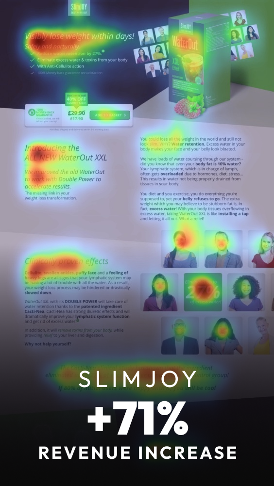
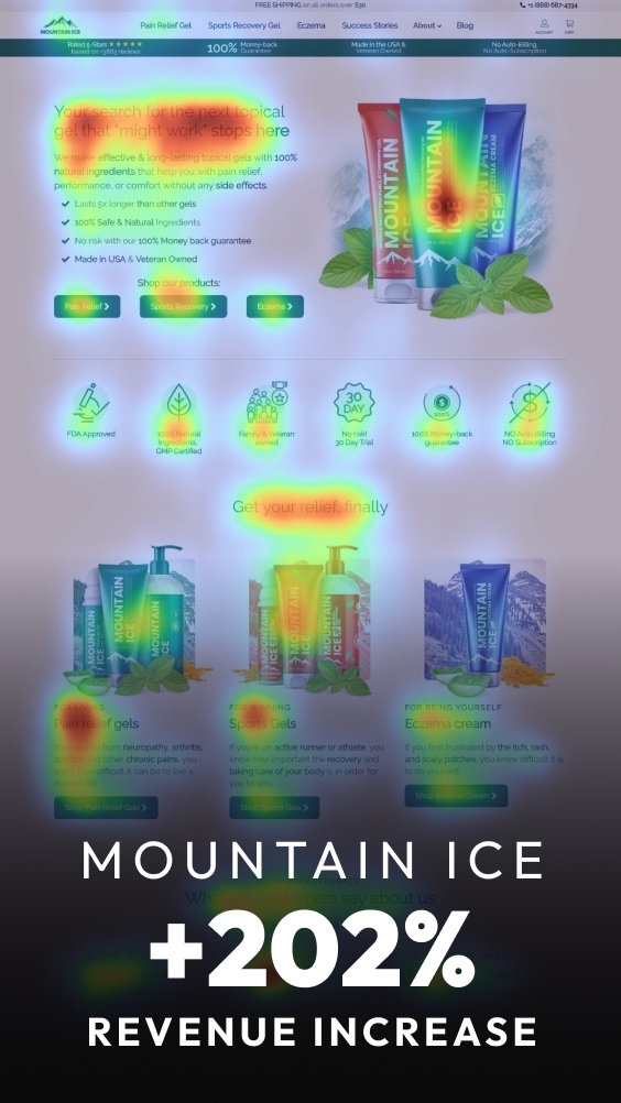
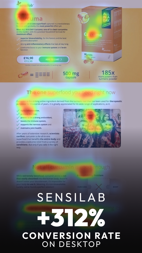
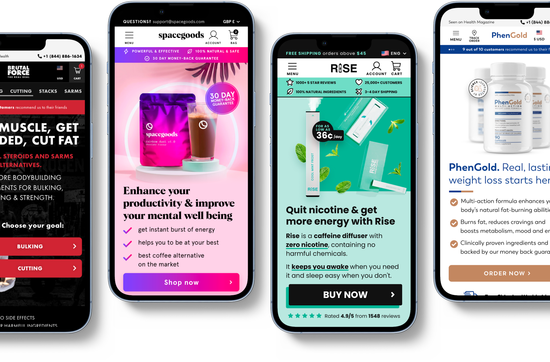
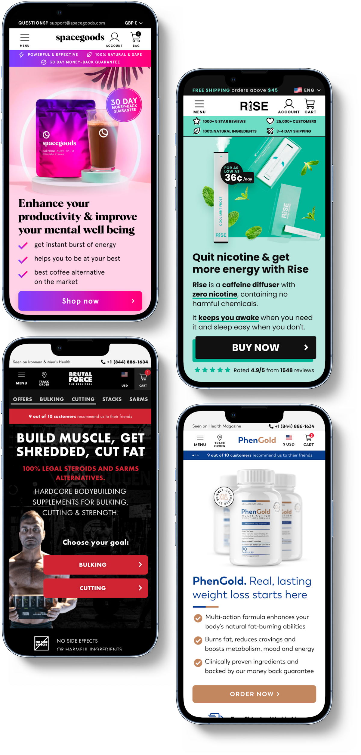
Specialized in the Supplements niche

Specialized in the Supplements niche
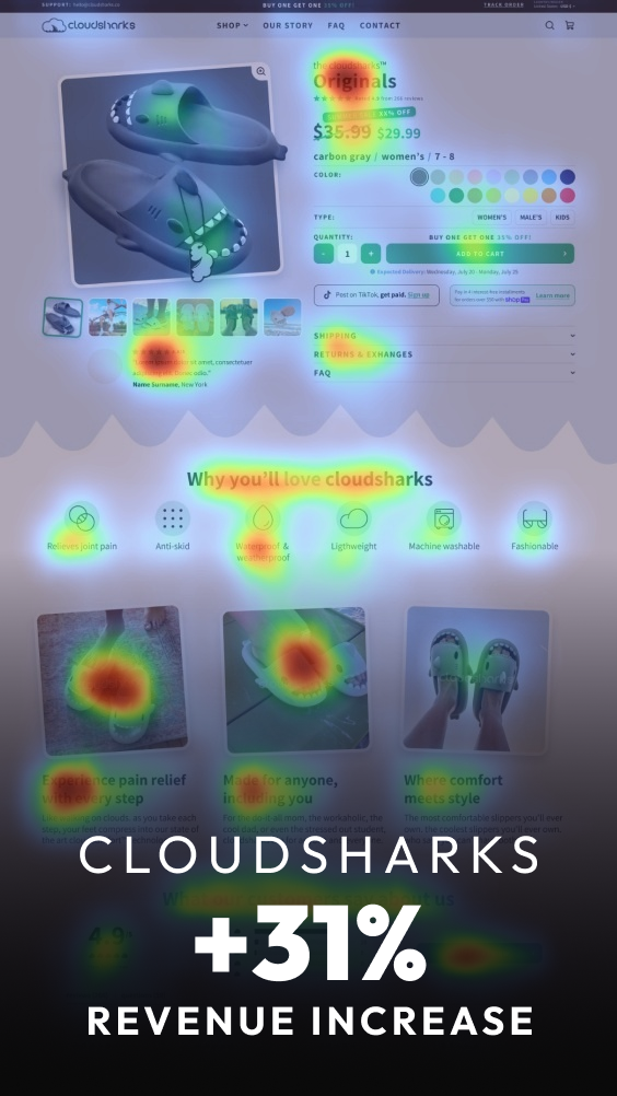
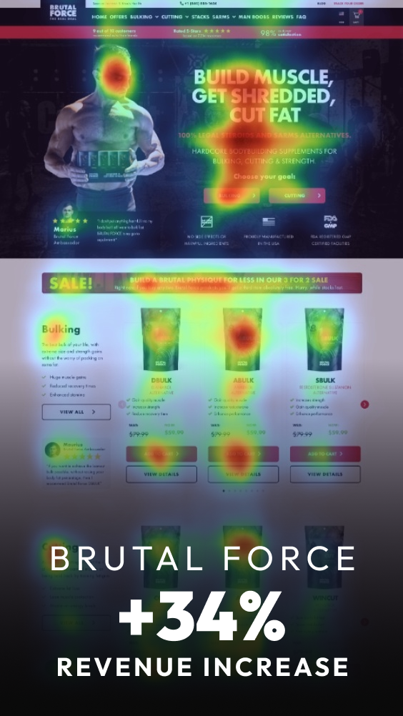
Clients saw 33%, 62%, 71% and even 312% increases.
The process is simple
Week 1
I send you a short questionnaire to fill out.
Once submited and I receive your assets I start on the heuristic analysis and ideation for your high converting design.
We'll also set the brand tone and talk about your look&feel. It's important we set this right.
Week 2-3
Start of the deep creative & design process to remove friction and increase clarity while implementing design behavior and persuasion principles with UX/UI best practices.
Once submited I start on the heuristic analysis and ideation for your high converting design to increase Conversion rate, AOV and LTV.
Here's also where we'll collaborate and see how far we can push things.
Week 4
Presentation of the new design, feedback and iteration to get it right.
You will receive full Figma ownership of the design file to handoff to developers for implementation and testing.
Get a CRO audit report with a manual check of your website with suggestions and recommendations for improvements.
Turnaround time: 1 WEEK
$200
21 - 70 conversion checks
$1.200$1.000
+ 250 conversion checks
Guaranteed results
Bonus: 1 Month of Data Analysis and Optimization
Need a fresh new look for your home page and products page that are on brand & convert better?
Increase your revenue by at least 20% in 3 months or or I'll work for FREE until we reach this target.
Turnaround time: 4 - 5 WEEKS
Book a callOnly 1 spot left
Got Questions? Feel free to email me at darjan@maxy.studio